Dec 8, 2021 4:22:10 PM
Retail | Operations


You’re walking along a busy shopping street when an interesting window display catches your eye. Next thing you know, without even realizing what you’re doing, you find yourself in line for the checkout with an armful of items.
Ever experienced this? Yep, us too.
Chances are you’ve also experienced the opposite: you go into a store actually wanting to make a purchase, but find the experience so uninspiring that you leave empty-handed and disappointed.
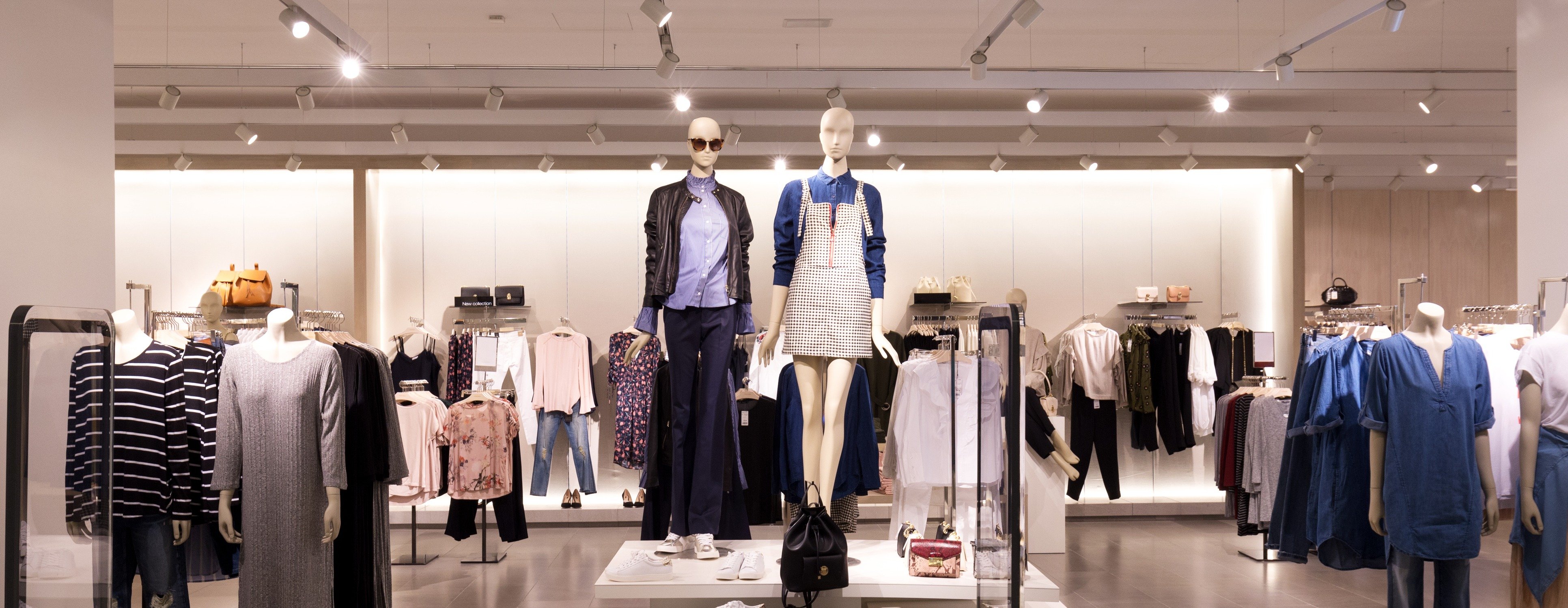
More often than not, the deciding factor here is visual merchandising. Humans respond best to visual stimuli, and although our choice between one store or another may seem fairly arbitrary, our decision is always subconsciously influenced by the store’s aesthetic and how that makes us feel.
In fact, Harvard Business School professor Gerald Zaltman states that 95% of our purchase decisions are subconscious.
With that in mind, a truly exceptional visual merchandising strategy is one that takes into account customer behavior and how we respond to visual stimuli. Here are some of our top tips for perfecting your visual merchandising, and the science behind them:
Related: 6 Top Retail Predictions for 2022 and Beyond
Tell a story
As we just mentioned, we’re very visually-oriented creatures. Visuals increase message retention by 42% - so it’s important to know what message it is you’re actually trying to send with the look and feel of your stores.
The H&M concept store in London, for example, with its stone flooring, gold mirrors and copious houseplants, immediately sets itself apart by looking less like a store and more like a boutique hotel.
Nike’s House of Innovation, meanwhile, goes for a high-tech, futuristic vibe that matches the digital efficiency and fluidity that the store provides in its customer service.
What it comes down to is visual storytelling. Increasingly, consumers are looking for brands that align with their personal values. Creating a strong visual identity in stores helps a shopper decide if they want your brand to be an extension of their own identity.
Related: The 5 Most Creative Experiential Retail Concepts and Why They Work
Use the right materials
The way you execute a VM concept informs the shopper on factors such as price, value and quality.
For example, wooden shelving connotes an ‘authentic’ or ‘organic’ feel, but can also imply higher prices. Curved, open shelving and displays are inviting, whereas sharp edges are off-putting.
And don’t forget to engage your customers’ other senses too: we may be talking about ‘visual’ merchandising here, but the scent you use in-store and the music you choose to play greatly contribute to the ambience, and is a subtle way to influence shoppers. Just think of Abercrombie & Fitch’s signature scent: love it or hate it, spraying it liberally in stores has made it an iconic part of their brand identity.
Consider the customer journey
If you’ve ever been put off buying from a store because it seems like an incomprehensible jumble of merchandise with no clear plan, you’ll understand why thinking about the customer journey is so crucial.
A store layout should be easy to navigate, and have a logical flow.
Make the signage clear, so that customers don’t need to ask a store associate where anything is. Put new merchandise at the front of the store to draw people in.
A 2021 study found that the most significant factor of VM which influenced customers to make a purchase was shelf management, so pay attention to how you display products around a store. Group related items together, such as batteries near the electronics or sneakers next to gym clothes. Put the items you want to push most at eye level, and ideally pride of place at the end of an aisle.
It’s also crucial to capitalize on impulse buys - something the average US consumer spends up to $5,400 on every year.
Use the area around the checkout wisely: putting inexpensive items near your point-of-sale encourages impulse buys, as shoppers are already committed to a purchase and are more inclined to add something extra to their basket.
Retailers like IKEA and Flying Tiger go one step further by designing their stores in such a way that shoppers have to walk around the entire store to reach the checkout - giving them ample opportunity to pick up impulse buys along the way.
Use the rule of 3
They say three is the magic number, and they’re not wrong.
Our brains can take in up to 11 million bits of information every second, but our conscious minds can only process 40 bits per second. So when it comes to visual merchandising, less is more.
Studies have shown that grouping products in sets of three - mannequins, products on shelves, and so on - is easier for customers to process. Any more than this, and you risk overwhelming them with choice.
Execute the concept flawlessly
The best merchandisers spend endless, painstaking hours putting together the perfect visual merchandising strategy, planning each element in great detail. But if stores don’t follow the concept to the letter, it won’t have the desired effect.
Related: The 3 Components of a Successful In-Store Execution Strategy
---
Ready to achieve flawless execution of visual merchandising guidelines across your store network? Request your free personalized demo below to get started!

Connect with Us